ux/ui design

Sezzle Mobile Directory
COMPANY

Sezzle

ROLE

UX Designer

YEAR

2021

Weather app image
Weather app image
Weather app image
Weather app image
Weather app image
Weather app image
Weather app image

Project Overview 🎯

Project Overview 🎯

Project Overview 🎯

Sezzle, a buy-now-pay-later service, currently faces an issue of most of their users only using the app when checking out. Sezzle asked our team to create an interface that would increase user retention in the app and encourage app usage from the discovery of products to the check-out process.

Role 👩‍💻

I worked alongside a team of 7 and took part in every step of the process, from research to ideation, testing, and prototyping.

Tools + Processes 🛠️

User Research (interviews, surveys), Comparative/competitive analysis, Persona creation, Journey mapping (via Miro), Low-High fidelity wireframes (via Figma and Whimsical), A/B user testing

Process

Process

Process

Understanding the Space

With a target user group of college students with no credit, our team organized our research efforts with this in mind.

We created screening surveys to find common financial characteristics and possible interviewees, conducted interviews with those interviewees to understand shopping behaviors in relation to financial goals, and did comparative analysis of app experiences with direct, indirect, and non-competitors for features aimed at promoting the product discovery. We then compared these applications with the current app workflow of Sezzle.

Synthesizing Research

To synthesize our research findings we utilized a personajourney map, and created hypothesis statements.

Our persona, Julia, was a cumulation of found behaviors to keep our ideation user-centric. Our journey map was constructed from interviews and surveys that visually displayed similarities and differences between online and in-person shopping experiences. This map helped identify design opportunities.

Our hypothesis statements (through questions like "How might we?") helped guide our team's ideation to identify what needed to be done to achieve our design goals.

Ideation: Blue-Sky v.s Normal

As we began ideation, our sponsor advised the team to split into two groups to test out two concepts: a "blue-sky" concept that is an entirely different experience from the current app flow, and a "normal" version that was similar to the current app flow.

To test which idea we would move forward with, we created low-fidelity wireframes and conducted concept-testing with users in our target group to gauge which concept they favored. From this we found that most users favored the "blue-sky" concept, which is what our team decided to move forward with.

Evaluation

Once we decided on moving forward with our 'blue-sky' concept, we created high fidelity, clickable prototypes. With these prototypes, we were able to conduct a few rounds of user testing to see what we could improve on.

We also updated our design colors to fit web content accessibility standards.

Solution

Solution

Solution

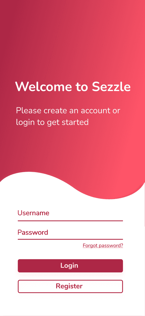
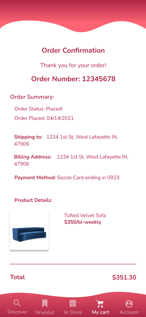
Our final concept consisted of a significantly altered information architecture to create an entirely in-app shopping experience.

Our redesign also addressed user pain points in the following list:

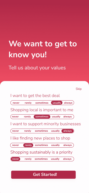
  • Onboarding experience allows for more personalization and presents items based on user preferences, reducing the feeling of being overwhelmed

  • Eliminates ambiguous categories that have product overlap and increases discoverability by showing products instead of brands

  • Compares qualities between products in a wishlist to give shoppers a quick overview, alleviating the stress in making a purchasing decision

  • personalize

    Transform your shopping experience by customizing your discover page to reflect your interests.

    Weather app image
  • discover

    Discover items curated for you, updated based on your recent orders and saves.

    Weather app image
  • compare

    Save and compare items in a wishlist to see which product is the best fit for you.

    Weather app image

Current v.s Redesigned

Current v.s Redesigned

Current v.s Redesigned

To further showcase the design changes, shown below is the comparison of the current design of Sezzle with our team's redesigned concept.

Weather app image
Weather app image
Weather app image
Weather app image
Weather app image
Weather app image
Weather app image
Weather app image

Product Discovery

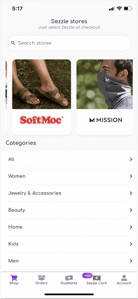
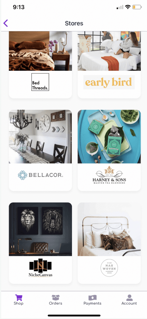
The current design (left) shows the product discovery page, or the first page the user sees. This design falls short compared to Sezzle's competitors- the categories are ambiguously named and there is a lot of overlap between the stores in different categories.

The current design (top) lacks organization without the option to personalize or filter searches. It is also difficult to identify which store to explore because the cards only have the name and an image. Users must infer what a store sells and it may cause them to be overwhelmed and intimidated.

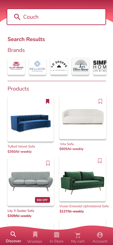
This redesign (right) presents products users are initially interested in based on their chosen interests when creating a profile. If sustainability or shopping small business is important, more products aligning with those values will appear in the feed. Ideally, it would continue to adjust what it displays based on what a user searches, looks at, and saves.

The product display is also better suited for discoverability, as users are first introduced to the type of product rather than a brand. This helps users find new places to shop that match their needs and values.

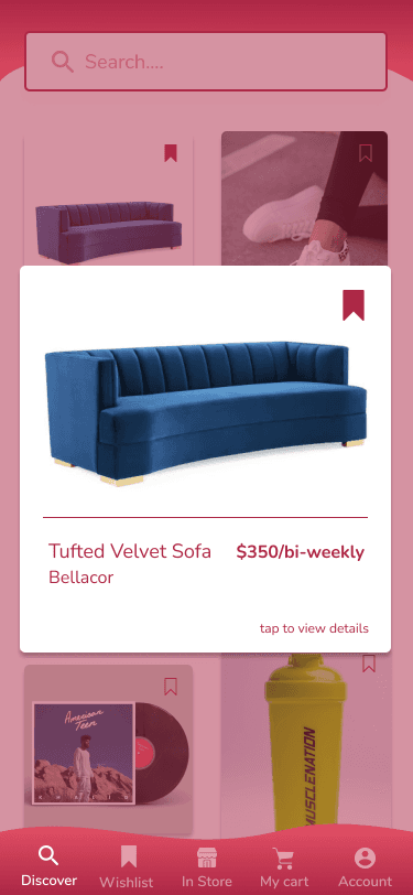
This redesign (bottom) is product-centric. A product view gives users the product information within the Sezzle app and the ability to add the product to a wish list or their in-app cart (when tapped, the pop-up will flip). The product information makes for better informed users, which gives them the ability to make more financially responsible decisions, as with Sezzle’s mission. Providing users with options or save or add to cart in one place also means they are not pushed into immediately purchasing something, so they can feel confident about a decision to revisit the product later.

Weather app image
Weather app image
Weather app image
Weather app image
Weather app image
Weather app image
Weather app image
Weather app image

Product View

The current design (left) lacks organization without the option to personalize or filter searches. It is also difficult to identify which store to explore because the cards only have the name and an image. Users must infer what a store sells and it may cause them to be overwhelmed and intimidated.

The current design (top) shows the product discovery page, or the first page the user sees. This design falls short compared to Sezzle's competitors- the categories are ambiguously named and there is a lot of overlap between the stores in different categories.

This redesign (right) is product-centric. A product view gives users the product information within the Sezzle app and the ability to add the product to a wish list or their in-app cart (when tapped, the pop-up will flip). The product information makes for better informed users, which gives them the ability to make more financially responsible decisions, as with Sezzle’s mission. Providing users with options or save or add to cart in one place also means they are not pushed into immediately purchasing something, so they can feel confident about a decision to revisit the product later.

This redesign (bottom) presents products users are initially interested in based on their chosen interests when creating a profile. If sustainability or shopping small business is important, more products aligning with those values will appear in the feed. Ideally, it would continue to adjust what it displays based on what a user searches, looks at, and saves.

The product display is also better suited for discoverability. Instead of users shopping blindly by store name and image, users are first introduced to the type of product. The amount of products they see from a certain brand will increase as they show interest in the brand. This helps users find new places to shop that match their needs and values.

Weather app image
Weather app image
Weather app image
Weather app image
Weather app image
Weather app image
Weather app image
Weather app image

Product Comparison

The current design (left) makes it difficult for users to compare products or view multiple products at once in an efficient way, as users are being navigated to a merchant’s website which each click. With many merchants being smaller businesses, users are not likely to be familiar with them and going store by store down the list is not time efficient.

The current design (top) makes it difficult for users to compare products or view multiple products at once in an efficient way, as users are being navigated to a merchant’s website which each click. With many merchants being smaller businesses, users are not likely to be familiar with them and going store by store down the list is not time efficient.

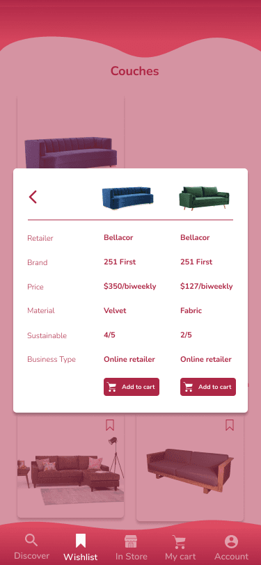
This redesign (right) allows users to select multiple products in a wish list and directly compare their information. This gives users the power to make decisions informed on more than just price, encouraging responsible decision making once again.

With this comparison feature in the reimagined app, users can compare products side-by-side and not need multiple tabs on a browser. In this part of the reimagined app, values are also reflected as users can see a sustainability rating for the compared products. When users are finished comparing they can either go back or add a product to their cart.

This redesign (bottom) allows users to select multiple products in a wish list and directly compare their information. This gives users the power to make decisions informed on more than just price, encouraging responsible decision making once again.

With this comparison feature in the reimagined app, users can compare products side-by-side and not need multiple tabs on a browser. In this part of the reimagined app, values are also reflected as users can see a sustainability rating for the compared products. When users are finished comparing they can either go back or add a product to their cart.

Weather app image
Weather app image
Weather app image
Weather app image
Weather app image
Weather app image
Weather app image
Weather app image

In-App Checkout

The current design (left) makes it difficult for users to compare products or view multiple products at once in an efficient way, as users are being navigated to a merchant’s website which each click. With many merchants being smaller businesses, users are not likely to be familiar with them and going store by store down the list is not time efficient.

The current design (top) shows the product discovery page, or the first page the user sees. This design falls short compared to Sezzle's competitors- the categories are ambiguously named and there is a lot of overlap between the stores in different categories.

This redesign (right) allows users to select multiple products in a wish list and directly compare their information. This gives users the power to make decisions informed on more than just price, encouraging responsible decision making once again.

With this comparison feature in the reimagined app, users can compare products side-by-side and not need multiple tabs on a browser. In this part of the reimagined app, values are also reflected as users can see a sustainability rating for the compared products. When users are finished comparing they can either go back or add a product to their cart.

This redesign (bottom) presents products users are initially interested in based on their chosen interests when creating a profile. If sustainability or shopping small business is important, more products aligning with those values will appear in the feed.

The product display is also better suited for discoverability. Instead of users shopping blindly by store name and image, users are first introduced to the type of product. The amount of products they see from a certain brand will increase as they show interest in the brand. This helps users find new places to shop that match their needs and values.

To learn more, view the full documentation here.