UX/UI Design
Hudl Focus Flex
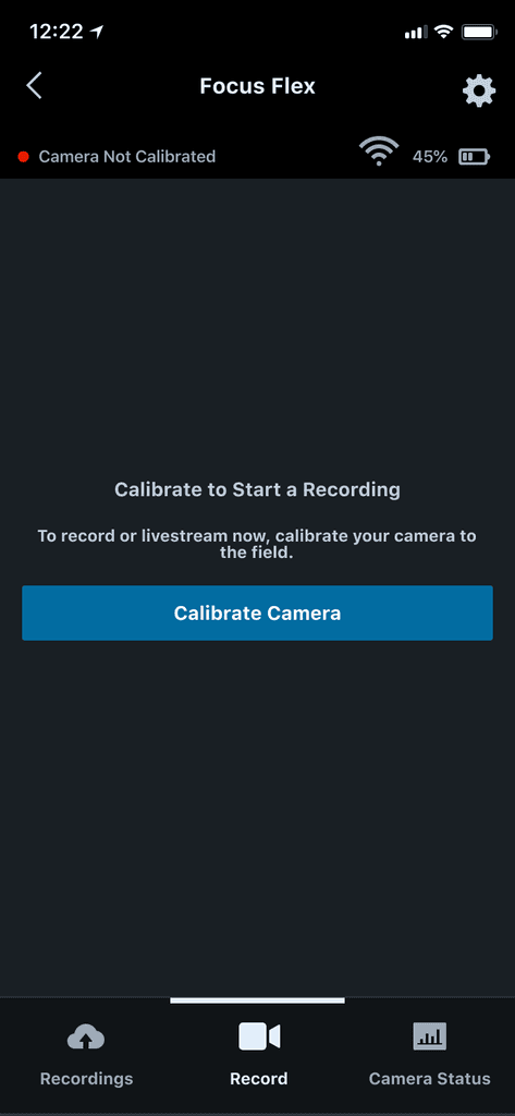
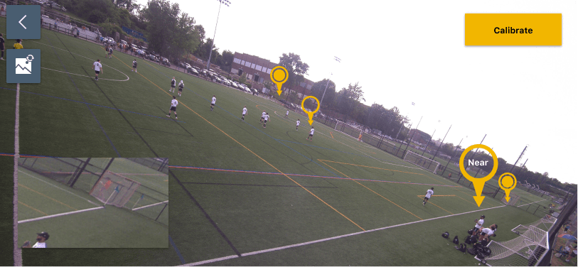
Hudl, a leader in sports performance analysis software and hardware, needs a backup manual flow for an automatic, AI-powered calibration process on their Focus Flex camera. The current process has been reported by users to be confusing and time-consuming.
The project goal was to design a calibration process that was seamless and easy to understand.
Role 👩💻
As a product design intern, I took the lead for this project. I worked with engineers, quality analysts, designers (product and content), and project managers to redesign the look and process of the new calibration design.
Tools + Processes 🛠️
A/B User Testing, User Research (via Dovetail), Interactive Prototyping (via Figma), Hudl Design System
Understanding the Space
To understand where the users were feeling frustrated, I analyzed past interviews on Dovetail, navigated the app myself, and sent out surveys to beta users to find the following pain points:
Calibration takes too long
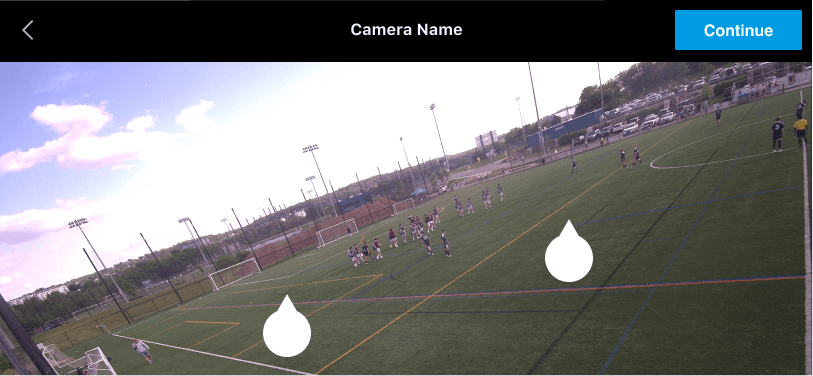
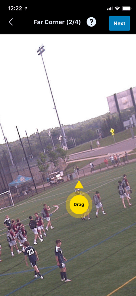
It's very hard to place pins accurately on the far corners (especially on grass fields, or if there are no corner flags present). Sometimes the white pins get lost in the sky
Some users don’t realize that they can zoom in during the calibration process
Users have trouble confirming and feeling confident in the quality of their calibration
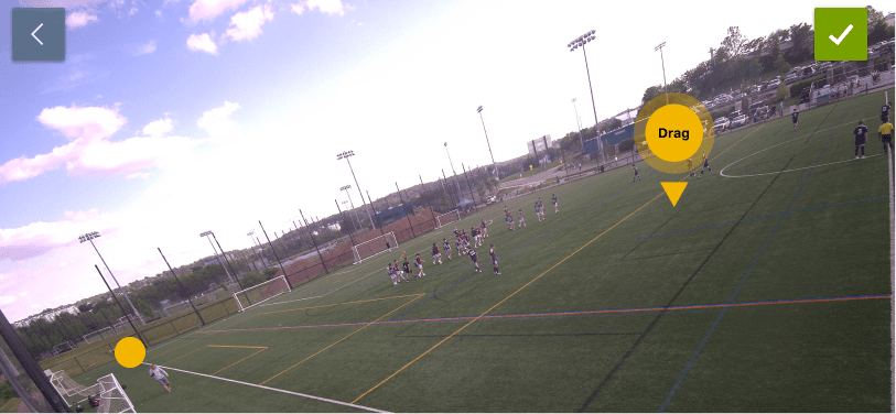
Pin Redesign 📍
As a side project, I worked to redesign the pins for the new calibration process. Users struggled with:
The color (the white pin would get lost in a bright sky)
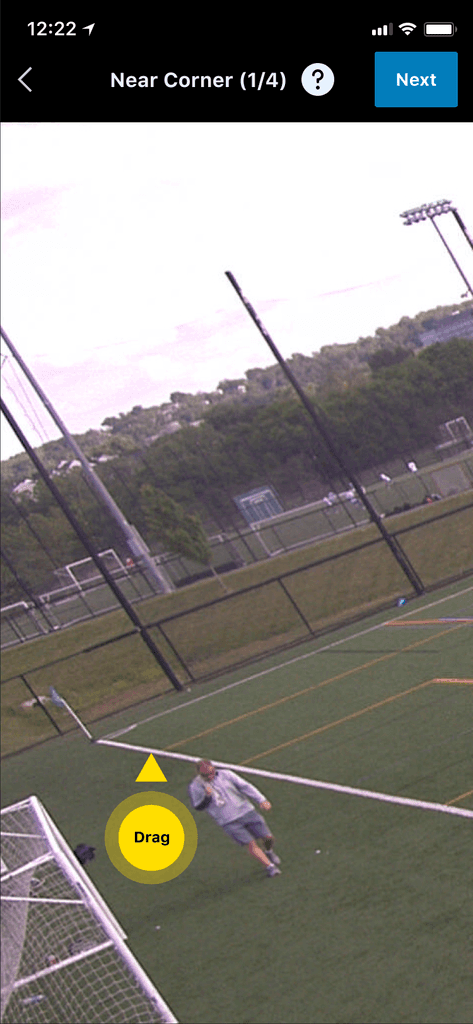
The shape (user dragged the pins with their thumb, leading to their thumb covering the whole pin)
The usability (confusion on if the triangle or the circle was supposed to go on the corner)
To learn more about this process, you can view my full pin design journey here.
Ideation 💭
As machine-learning for Flex improves, users currently only need to plot 4 points: each corner of a soccer pitch.
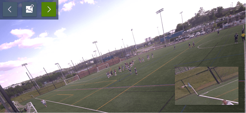
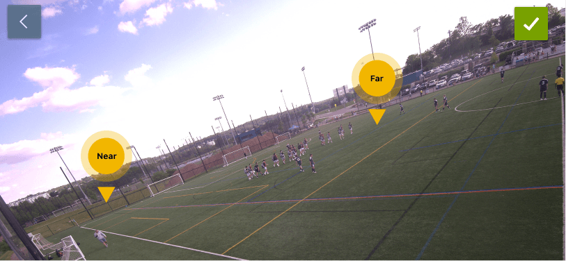
After some sketching and consulting with engineers and designers, we decided on two main ideas: calibrating with two pins on the screen at once, and calibrating one-pin-at-a-time. The former was an updated version of the current process, while the latter was a completely new idea. I created the prototypes for these scenarios in Figma and made them clickable to be ready for testing.
During prototype creation, I also ideated on different ways to display floating navigation and visual aids for the user. I wanted to create elements that were easily navigated by or around thumbs (what surveys told us about how our users were calibrating) but not too overwhelming on the screen.
To narrow down on floating navigation, I created multiple variations and worked with other product designers to iterate and decide on a structure.
A/B User Testing
I reached out to 10 Flex users who were found from interviews or were survey responders that had complained about flex calibration. This test was conducted over Figma through interactive, clickable prototypes. The test was conducted in an A/B style testing with two scenarios and two options each, all of which were compared against each other.
I conducted two scenarios: one where the user needed to plot all 4 points of the pitch, and one where the user only needs to plot one point since machine-learning has detected the others. This recreates a situation that most flex users currently face.
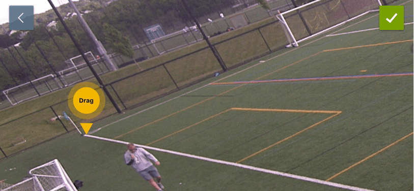
The concept passed onto engineers at the end of my internship was to calibrate a field by plotting one-pin-at-a-time with a view of a pre-zoomed in corner.
The new design:
Gives coaches more confidence on which line they are placing the pin on
Saves time from having to zoom in on their own and search for the corner
Gives clarity on how to interact with the pin
This design was implemented into the app. You can view it here (step 4).
