web design
Skincare, Simplified
Bringing routine building, ingredient analysis, and compatibility checking all in one place — so skincare finally makes sense.
context
Project Overview
The Challenge
Skincare should be simple — but between conflicting ingredients, misleading marketing, and paywalled apps, building a routine that actually works feels overwhelming. After going down my own skincare rabbit hole, I noticed a gap: no tool combined routine building, ingredient checking, and compatibility analysis in one place.
The Solution
I prototyped a webapp to address these gaps.
my role
What I Owned
Discovery & Research
- →Competitive Analysis
- →User Flow
Design & Prototyping
- →Wireframing
- →Figma Make for Iterations
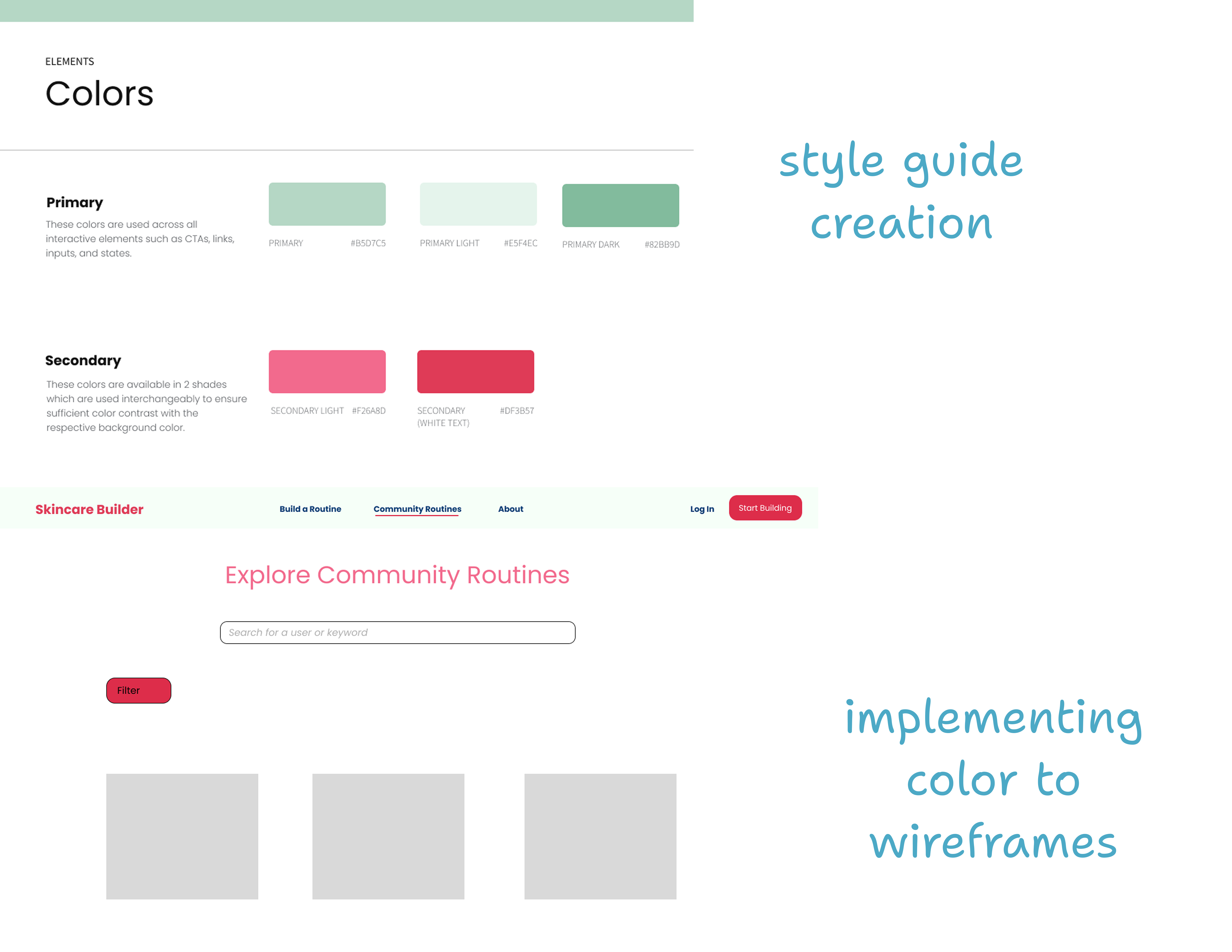
- →Style Guide Creation
outcomes
The Prototypes
A simple website that achieves it all: craft a personalized routine, view community routines, and check the compatibility of ingredients in your current routine. This was a self guided project to grow my familiarity designing with AI and to create a passion project for my interests- the design is consistently being refined in my free time.
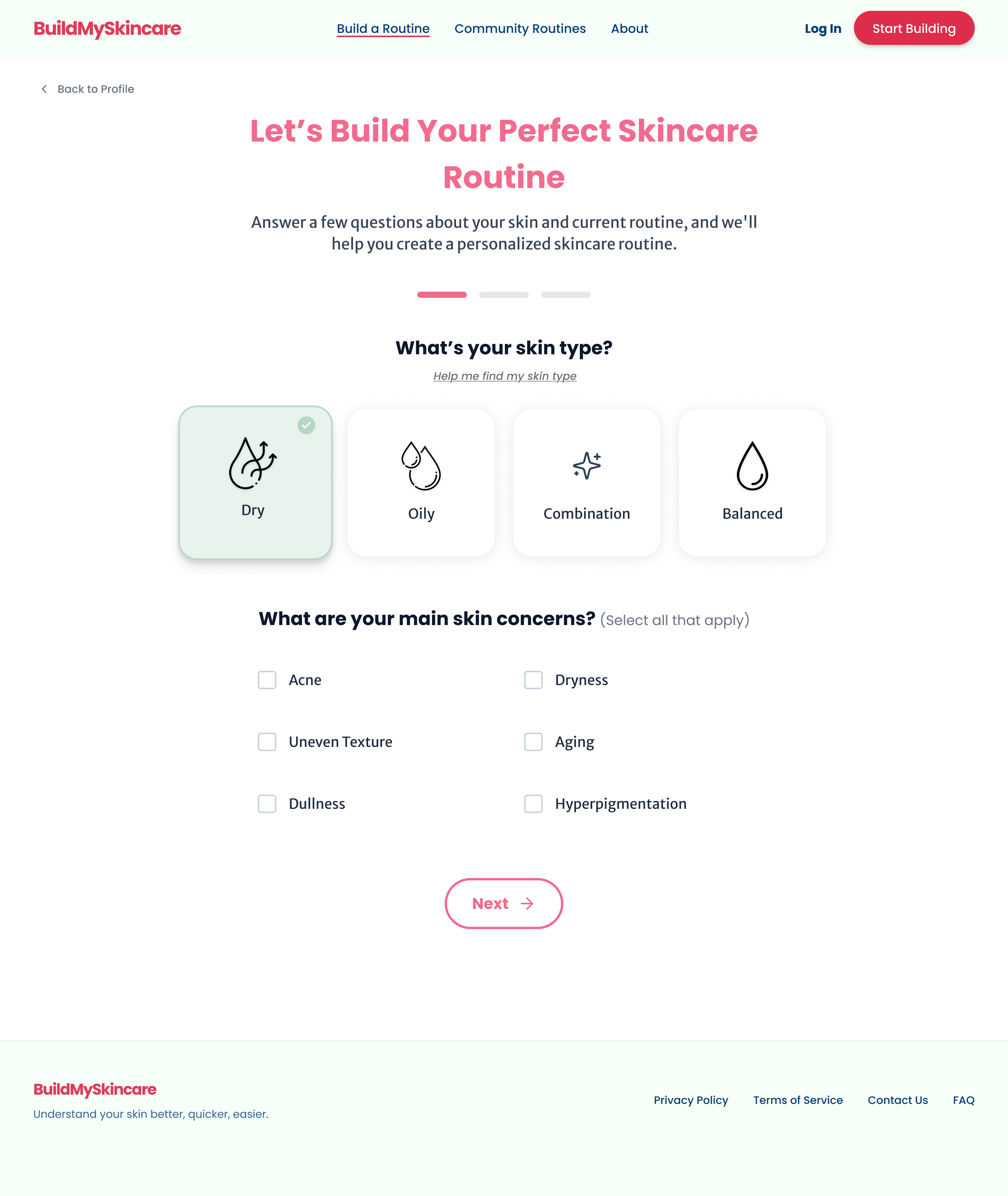
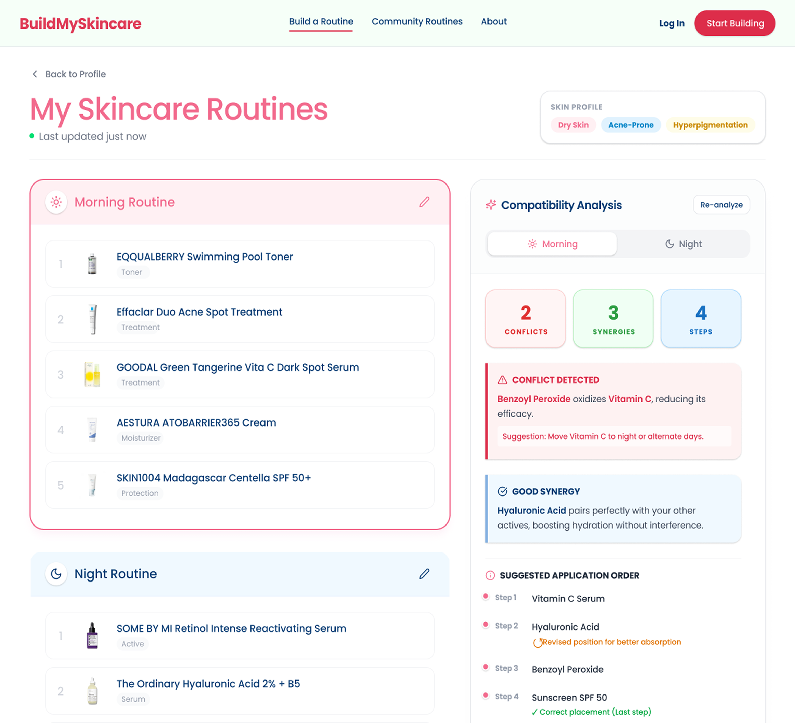
Personalized Skincare Routine (Slide 1-2)
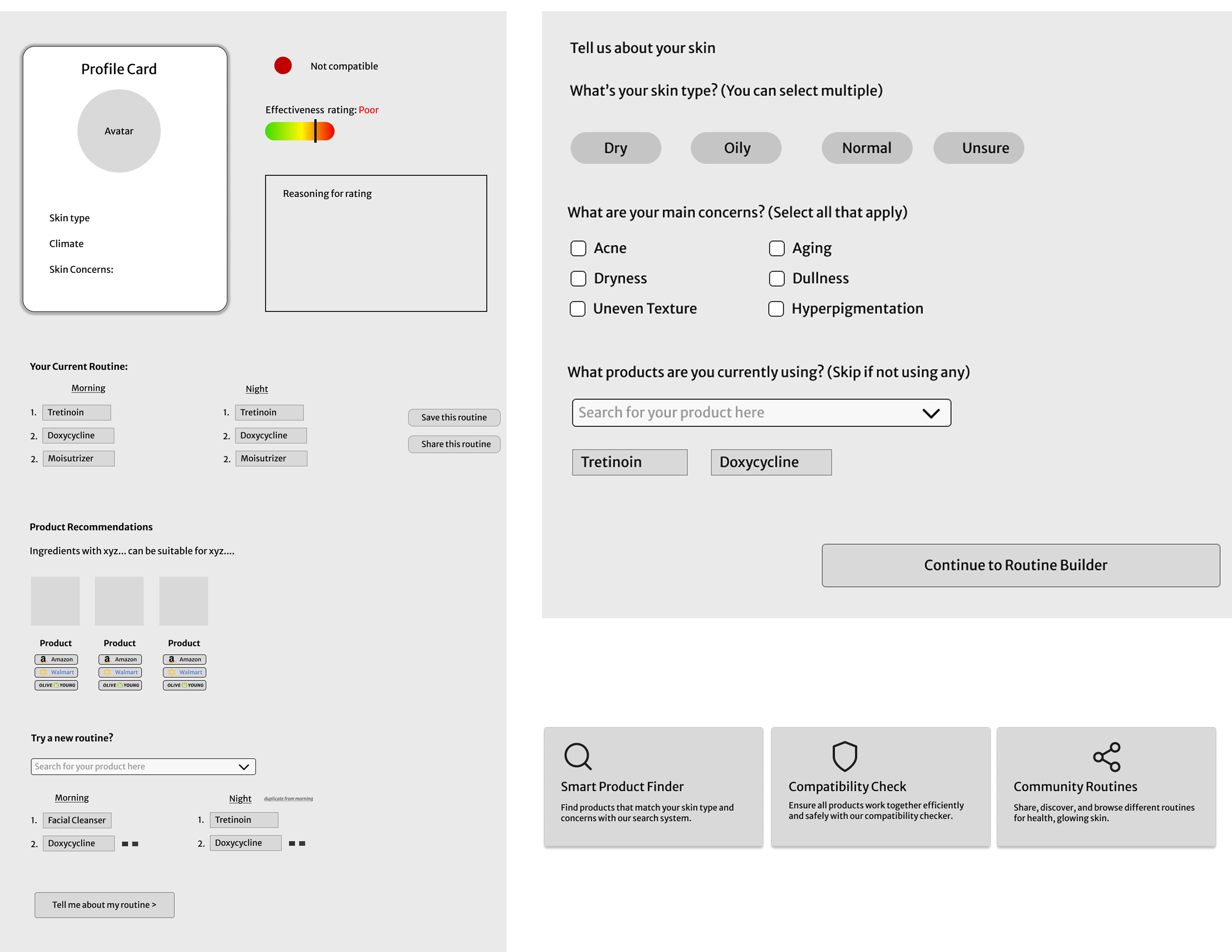
After a short quiz, the app curates a routine based on user concerns and climate—offering clear direction in an otherwise overwhelming product landscape..
Ingredient Compatability Analysis (Slide 3-4)
Because some ingredients enhance absorption while others conflict, the compatibility insights and shows users how their specific routine performs.
Community Routines (Slide 5)
Users tend to trust widely used products that directly address their concerns. I wanted a feature that showed community-backed options in a space separate from paid promotions.
methodology
The Process
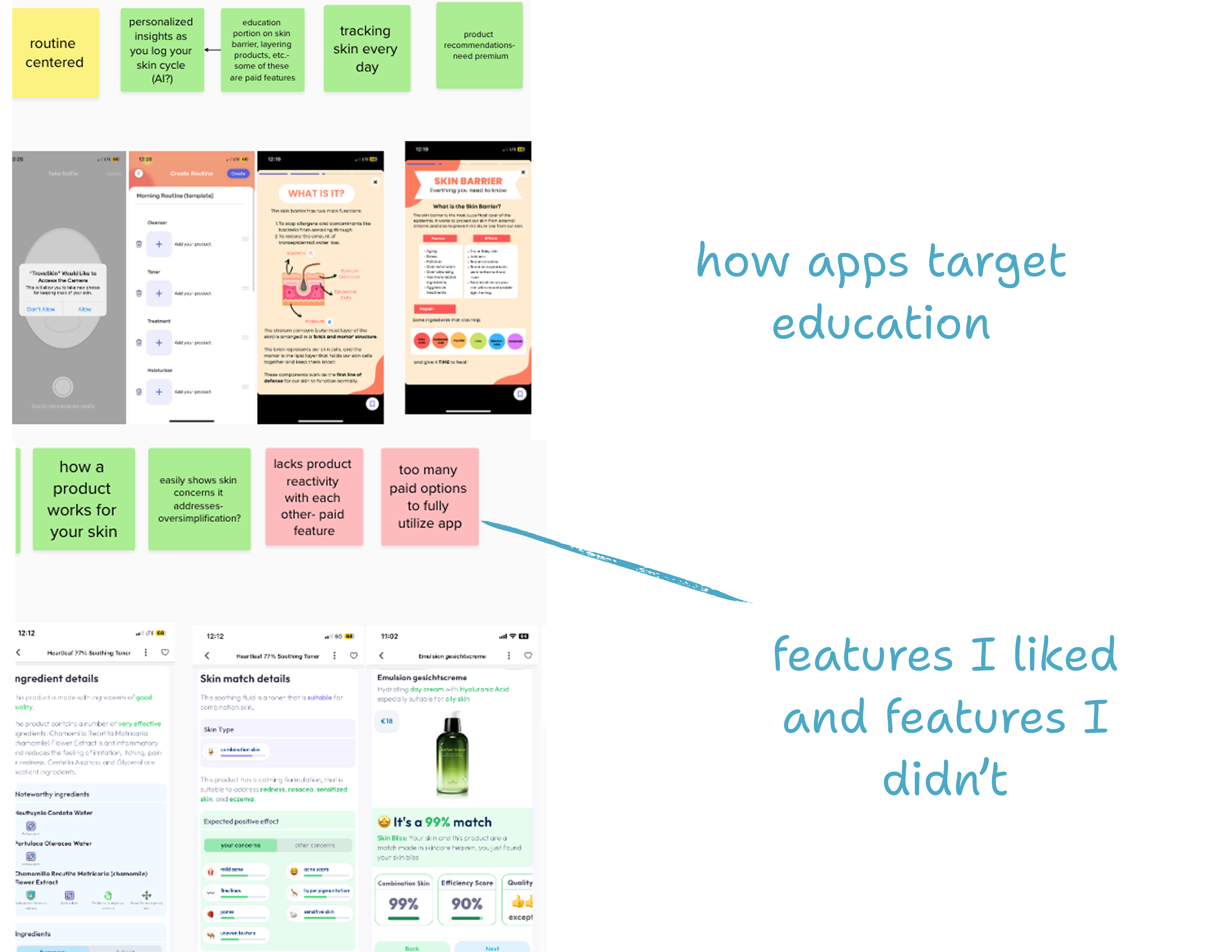
Competitive Analysis
I looked at existing skincare apps, websites, and how people often asked skincare questions. The idea for this project came from many hours on skincare subreddits.
Ideation > Experience
My research informed me of the gaps between different sites: no one had it all. From this, I drafted potentials flows for how a user would interact with the site, narrowing down to three main areas that were most commonly searched for.
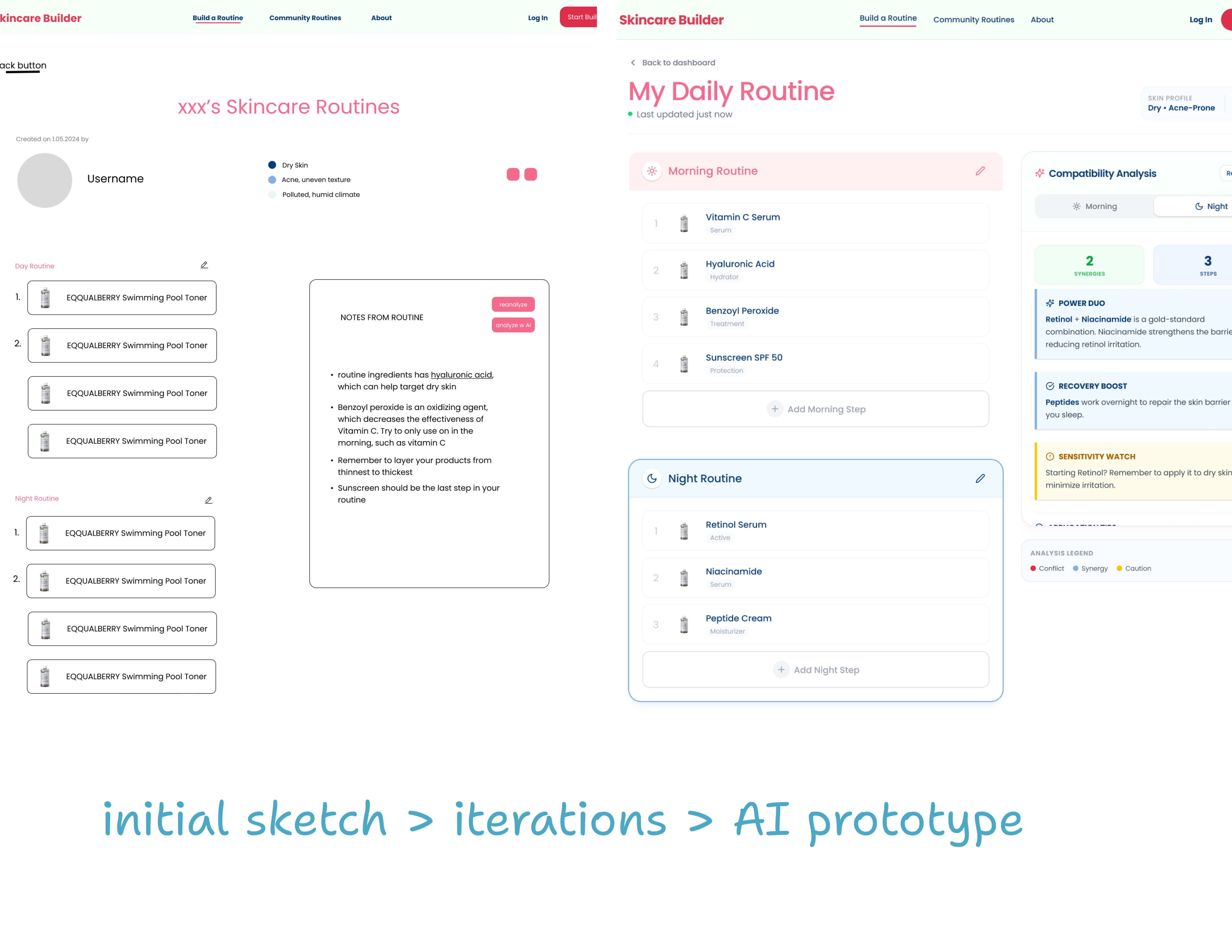
Wireframes
I created a style guide to establish an identity for the site, and used that to draft initial wireframes. I worked with a software engineer to determine feasibility for different features — because good design doesn't need to be complicated.
AI Prototyping
With the wireframes I had polished, I utilzied Figma Make to help me iterate on my designs and fill in the blanks. It helped populate text, created a more structured look, and helped give inspiration for the next iteration.